Flyleaf 2.7 – All the little things
Flyleaf 2.7 brings some pretty noticeable design tweaks to Flyleaf, with a new sidebar on iPad and Mac (and the upcoming iPhone Duo). The new article actions view on iOS puts tagging, article info, and reading settings just a few swipes away. Plus, the new “Stack” pagination style makes turning pages feel way more like reading a book or a magazine, which is what Flyleaf is all about, after all.
Here are some highlights from the update:
Drag and drop in the new sidebar
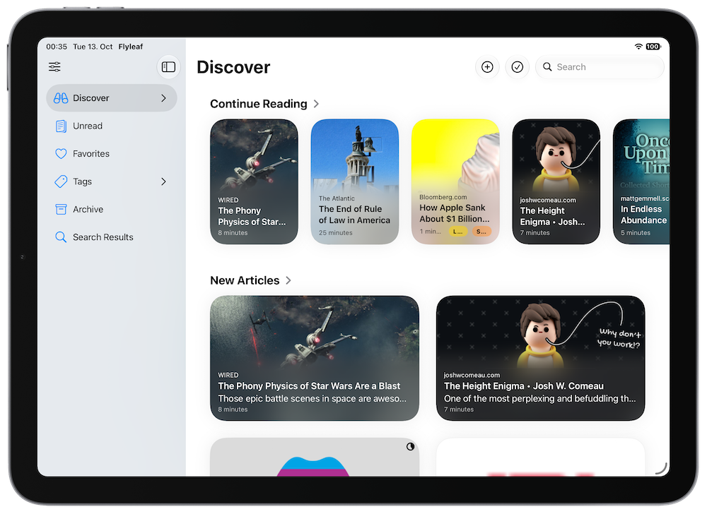
The all-new sidebar1 is the quickest way to get to your different lists of articles. And you can actually drag and drop any article into the sidebar to add it to a list. Very handy.
Redesigned navigation bars
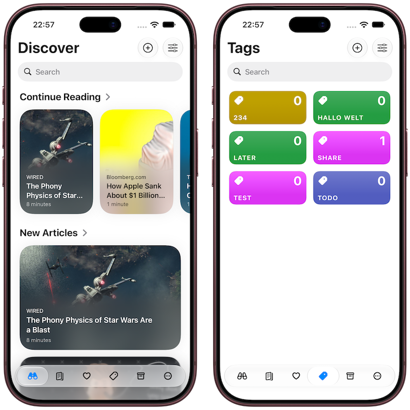
The navigation bar in article lists now takes up less vertical space, and it fades away when you scroll down. You can still access everything without having to reach for the top of the screen via the tab bar.
Oh, and when you’re on a tag, you can actually create a new tag or edit existing ones right from the toolbar.
Less tapping, more swiping
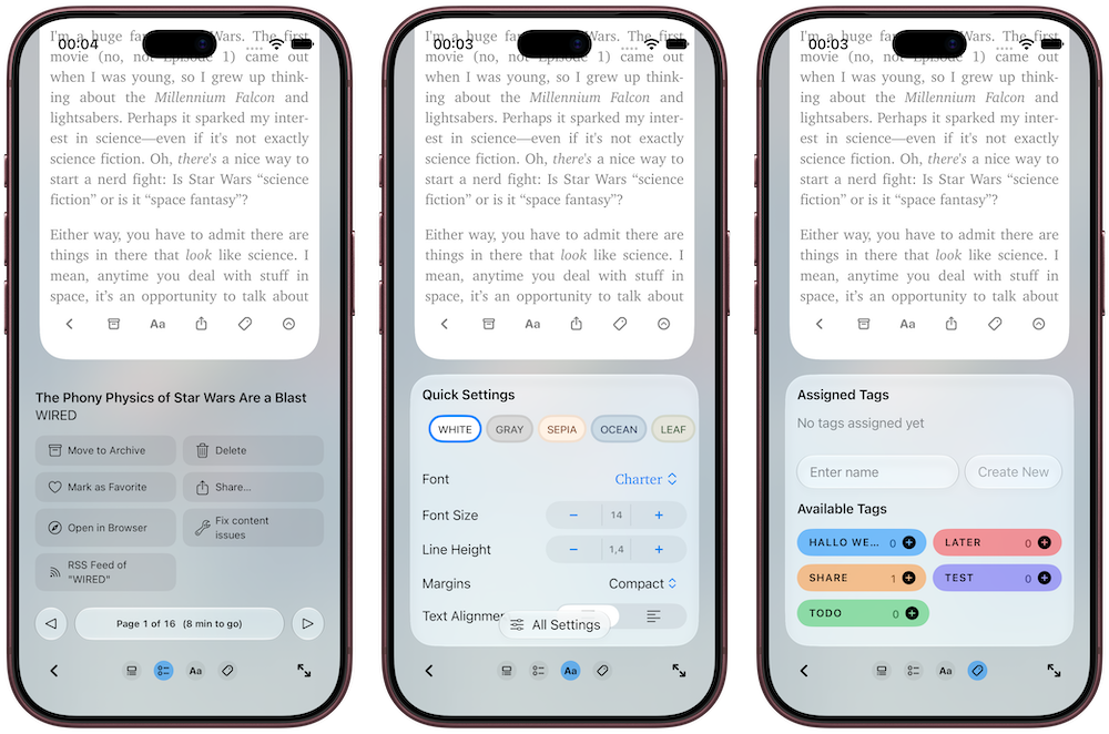
Swiping has always been a huge part of the Flyleaf reading experience. Instead of scrolling vertically, you swipe left to right from page to page. That kept vertical swipes free for accessing article details and actions.
With Flyleaf 2.7, all of these views that used to be separate popovers are now one swipeable area, giving you seamless, intuitive access to quick settings and tags.
No more blindingly bright article images when coming back to the article list in dark mode
Flyleaf has had the ability to dim article images in dark mode for a long time. But with 2.7, it will dim images in article lists, as well. But it’s smart enough to only dim images that are actually bright. Images that are darker retain their original brightness.
A more tactile pagination animation
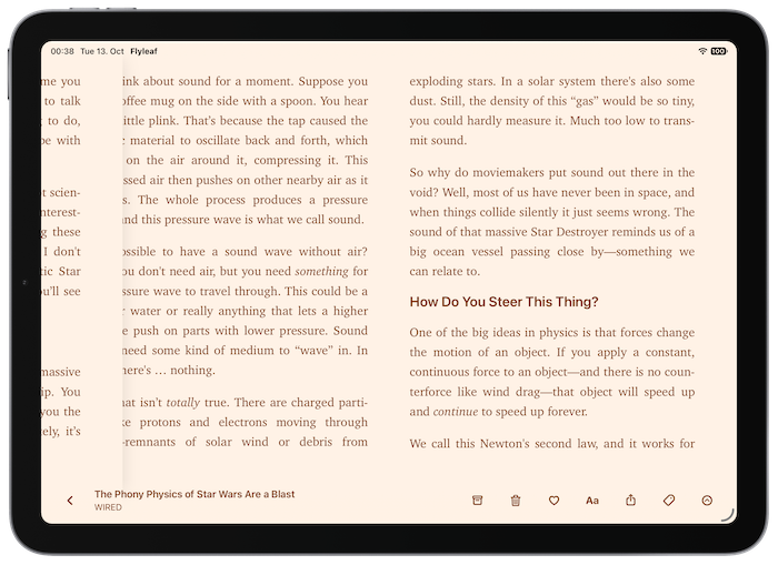
The horizontal pagination is probably the Flyleaf feature that is the most important to me. And with Flyleaf 2.7, it gets a significant improvement: Pages used to lie on one continuous plane, and you were “sliding” between them.
After the update, pages are instead stacked on top of another, and you swipe away the current page to reveal the next page below it. This causes much less distracting movement and feels less digital and more like reading an actual book or magazine. (But if you prefer the previous style there is a setting for that).
Great on iPhone Duo
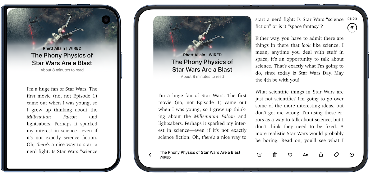
Version 2.7 brings some vital adjustments to make Flyleaf work great on the larger (and smaller) screens of iPhone Duo. The new sidebar is available when the iPhone is unfolded. And you can read two pages at once, like on iPad. The book-like feel of iPhone Duo is actually a great match for the page-based reading view in Flyleaf.
Under-the-hood improvements
I rewrote big parts of the underlying navigation structure in Flyleaf. Allow me to “talk shop” for a moment: the article view is no longer a navigation view pushed onto the stack, instead it is a full-screen sheet. This resolves some performance problems and visual glitches. Also, I switched the search bar to the native .searchable() modifier, which makes the search bar behave and look more like you’re used from other apps on the respective platforms. Finally, because the article list can no longer appear in the new sidebar on macOS, I was able to remove a lot of complicated and slow code.
I’m very happy with the improvements these changes have brought, and with the future improvements I’ll be able to build on top of this new structure!
iPhone, iPad and Mac

As always, here is the complete changelog for the Flyleaf 2.7 update:
New Features
- iOS: Redesigned article actions view with horizontally swipable sections
- All-new sidebar on larger devices
- Optional “Stack” pagination style where pages appear on top of one another instead of in a continuous row
- Import local PDF files into Flyleaf through the share sheet, the “open” menu or via drag-and-drop
- New ways to create a new tag outside of an article
- New context menu entry to start a search from selected text in an article
Improvements
- Performance improvements all around thanks to some substantial rearchitecting
- Improvements to tag management
- “Darken bright images in dark mode” now applies to images in article lists as well
- The article parser is now better at removing noise from the beginning of articles
- More consistent handling of page margins
- Layout tweaks for the upcoming iPhone Duo
- iPad: Better status bar handling in full-screen mode
- iPhone: More intuitive search bar placement
Bug fixes
- Fixed some cases where a URL added through the share sheet got corrupted
- iOS multi-selection should now be more reliable
- Cmd-F now reliably focuses the search field
- The tag order in the share sheet now matches other tag lists
- The Goodlinks importer now handles invalid URLs better
-
The macOS version always had a sidebar, but it was not great. I didn’t like that the sidebar could be shown next to the article that you’re currently reading. The point of Flyleaf is to let you focus on reading and let everything else fade away, after all.
The new sidebar replaces the tab bar instead of the article list itself. This makes it way more useful when browsing articles, and when you start reading, the sidebar disappears into the background, letting you focus on whatever you’re reading. ↩